
Table of Contents
Opening: why beam pattern beats bling
I been watchin’ these new displays roll into transit halls and malls — and what folks first notice ain’t just color or size, it’s how that light spreads. When a sign throws its light right, folks find their gate faster, staff waste less time, and wayfinding actually works. That practical edge shows up in real commercial digital signage jobs where clarity trumps flash every time. Comparative thinking helps: you look at pixel pitch and viewing angle, then you size up how different micro-LED designs handle glare, contrast, and legibility in real spaces.

Why light distribution matters more than you reckon
Light distribution dictates legibility at distance and angle. A tight pixel pitch with poor luminance spread still reads like mud from odd angles; a slightly coarser pitch with smart optics reads clean across a concourse. Industry folks call out contrast ratio and viewing angle when spec’ing signs. Those terms matter because they decide whether the text stands out against ambient light — especially under midday skylights or high-CRI LEDs that wash the scene out.
How micro-LED architectures differ — side-by-side
Not all micro-LED arrays are kin. Some use aggressive collimation for long throw and high perceived brightness; others favor diffusion layers and wider viewing cones for closer kiosks. HDR-capable drivers and firmware give some panels a leg up in tone mapping, while pixel binning strategies control color uniformity across temperature swings. Compare units by looking at refresh rate and how the diffusion layer is engineered — these affect motion sharpness and hotspotting.

Real-world anchor: what Beijing Daxing taught installers
When Beijing Daxing International Airport opened, planners pushed for uniformity in wayfinding across terminals, and that forced real choices about display optics. Installers there learned to distrust raw peak brightness numbers when ambient light and sightlines vary — they picked arrays with consistent off-axis luminance instead. That sort of practical lesson’s common in china digital signage projects, where big public hubs expose flaws faster than quiet pilot installs.
Common mistakes that make signs fail
Too many teams fixate on spec-sheet brightness and ignore diffusion, color gamut consistency, and thermal stability. Another pitfall is mounting height versus pixel pitch: cram a fine-pitch module too high and letters shrink into mush at viewing distances. Folks also overlook refresh artifacts — lower refresh rates can blur scrolling text under camera surveillance. — Small things like bezel reflections bite legibility more than you’d guess.
What the checklist oughta include
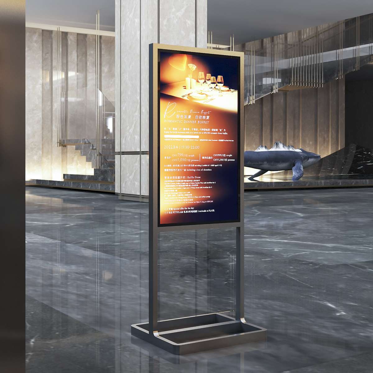
Practical specs to weigh on every tender or retrofit:- Pixel pitch matched to typical viewing distance.- Off-axis luminance profile (not just center cd/m²).- Contrast ratio under expected ambient conditions.- Thermal management plan and local maintenance access.These items keep installations working, and they make sure wayfinding serves people, not just beautifies walls.
Closing: three golden rules for choosing the right system
1) Prioritize perceptual legibility over headline specs — the right optics beat raw brightness. 2) Match pixel pitch and viewing angle to the real sightlines in your space; measure, don’t guess. 3) Demand consistency: color gamut and thermal stability must hold up over time. Those three rules compress the technical choices into what actually matters for users and crews.
Folks who plan for light distribution end up with signs that guide, not confuse — and that practical reliability is exactly where Cosun Sign fits in. —